Contrast is a designer’s best friend when it comes to creating a striking arrangement. Here are some of our favorite ways to incorporate contrast:
COLOR
Color is one of the easier ways to add punch to your arrangement. Choosing two colors on opposite sides of the color wheel can make for striking contrast.
SCALE - TEXTURE - SIZE
Do you prefer more subtle colors or a monochromatic look? No problem. You can still pump up the contrast by mixing up the bloom and foliage shapes, sizes & textures. Big, bold leaves or flower petals are lovely when paired with fine-textured ferns or tiny inflorescence.
LIGHT
We love sprinkling dark accent flowers into a light, bright mix of blooms, or visa versa. It helps add dimension to the arrangement overall.
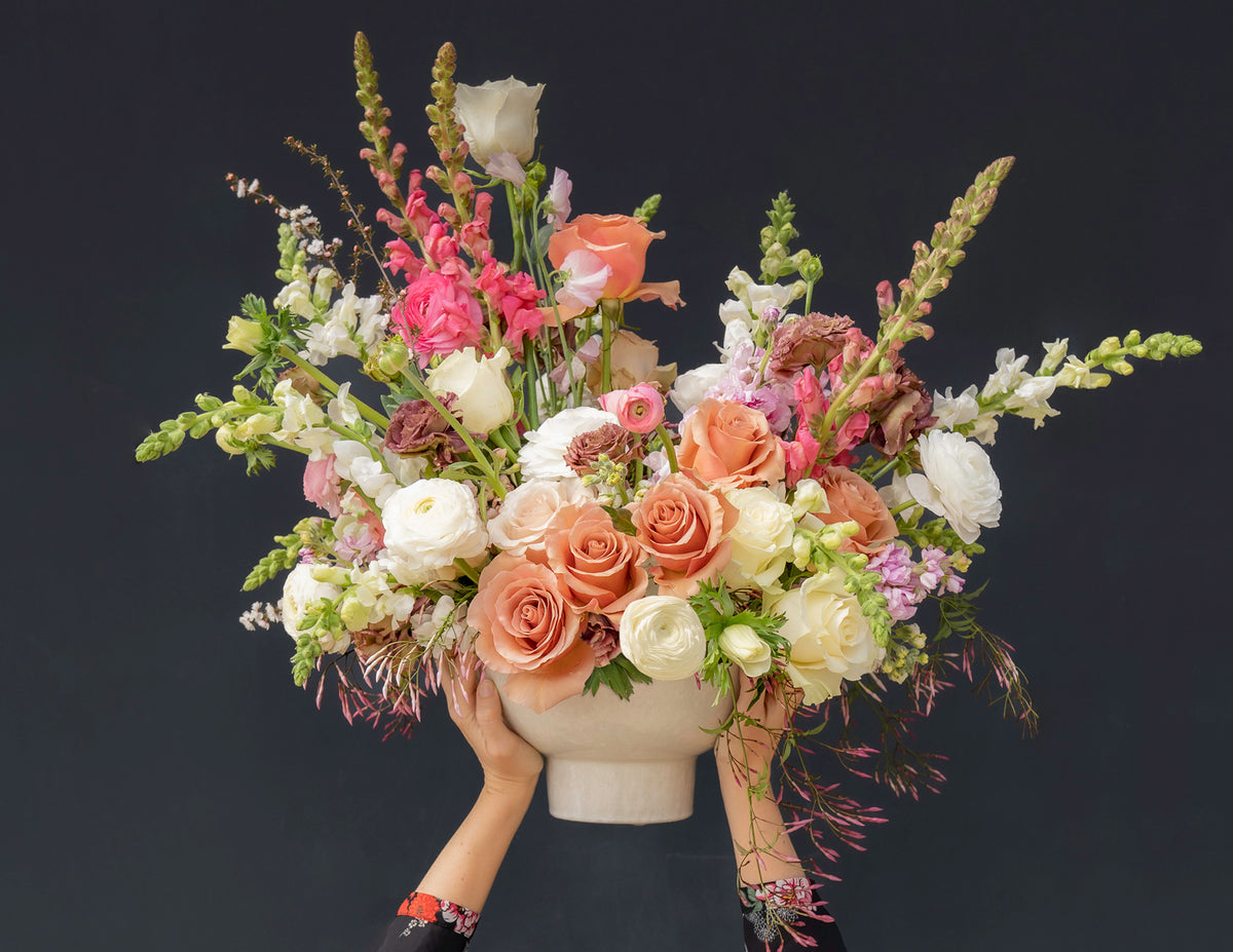
CONTEXT
Finally, its always good to know where your flowers are going and what they're going in! A contrasting vase is a fun way to make your arrangement pop on the whole, or you can pick a boldly-colored wall to set them in front of.
And now, the best part - visual examples of contrast!


DO YOU WANT TO EXPLORE WITH CONTRAST AS WELL?
Try ordering our Bundle of Blooms, and creating your own contrasting arrangements. Then, try taking a few pictures of them, experimenting with different kinds of backgrounds. It's fun to see how a light, bright, or dark wall can totally change the feel of an arrangement.

